


Your school or district’s website’s “news” section has never been more important. In a socially-distanced and virtual world, your community is craving familiar connections, feel-good content and up-to-date information. So, if you haven’t taken a look at the user experience of your news section, now is a great time to do so!
First things first: What makes a good news section?
- Clean design: Website visitors seeking news want it fast, so your news section should not be muddied down. A clean, mobile-first design ensures visitors can find whatever they need from whatever device they have.
- Up-to-date information: You should aim to update your school or district’s website section at least once per week — however more often is better.
- Filterable content: The best website experiences are those driven by the user’s wants and needs. The content within your news section should be easy to filter by type of story. (Think athletics, distance learning, feature stories, etc.)
- A constant flow of information: Leading digital publishers such as Buzzfeed, CNN, The New York Times, and The Skimm have changed the way we engage with news. When you select a category, you’re served up dozens of articles based on both recency and popularity. And then, when you select an article, you’re prompted to engage with more “similar content.” Your website’s news section should offer this same user experience in order to keep visitors on your website and engaged with your content.
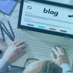
- A clear distinction between blogs and news content is essential: Often schools combine their news and blogs into a single stream of content — however, if your school has both a news section and a blog, it’s essential to keep these content pieces separate. News content is timely, while most blog content is evergreen. If your school does not currently have a blog, and does not plan to have one, evergreen content like feature stories or helpful tips could be categorized in a “feature” or “lifestyle” type category.
Your prospective and current families want to find timely information that interests them easily, and it’s your job to make that user experience as seamless, easy and engaging as possible. So, if you want to increase engagement and readership of your school or district’s news section, make these six simple changes. (Bonus: most of them will take less than a few minutes!)
Six steps for a better website news section:
- Send them to a website page, not just a lightbox
- Add additional reading links
- Be consistent with images
- Use categories and tags to simplify searching
- Add social sharing buttons
- Format content to make it scannable
News Considerations in Light of COVID-19
Before diving into best practices for building your news page, there are some important considerations for your school or district’s news section that have changed in light of COVID-19.
First, creating a separate news page, category or tag for distance learning, virtual events, and COVID-19 related updates is important to allow families to find essential information about your school’s distance learning plans and coronavirus responses.
Second, building a centralized “communications hub” that houses all communications for your school or district, including announcements, news, videos, press releases, and even some blog content. Parents need a one-stop-shop where they can find anything they need to know to stay informed. How you structure and organize your news content will greatly influence the user experience of this essential hub.
Okay, now onward to building a great news section!
1. Send them to a website page, not just a lightbox.
Lightboxes, which are on-page pop-ups that appear when you click certain actions on a website, have always been a popular way to display news on school websites because they provide access to content in one click, and keep website visitors on the same page.
However, lightboxes are not an ideal solution for news stories for a few reasons:
- They don’t provide the same modern news experience today’s website visitors expect. Tiny boxes with lots of texts and lots of scrolling are not ideal, especially on mobile.
- When you display news a light box, you don’t provide a direct link to the news story, making it difficult to share in email and on social media.
- Lightboxes are not indexed as their own pages — so for rotating news stories on a homepage displaying in a lightbox, Google may have a hard time crawling it, and it therefore won’t have a long-term impact on search visability.
Displaying news articles on individual pages ensures the content is mobile-friendly, can easily be shared across communications channels, and will be crawled and indexed by Google.
If you still wish to use a lightbox for the news stories displayed on your homepage to keep visitors there, add a “view more news” button that sends website visitors to a main news landing page on your site. From here, you can display the news content on individual pages so that it exists somewhere besides a lightbox, without having to write the content twice.
The Hun School of Princeton’s award-winning best-in-class website touts this exact user experience, and it works beautifully! Visit the homepage, and you can easily click on the school’s most recent news stories (which display in a lightbox).
When you click “all news” you are brought to this stunning landing page, where each news story then lives on its own individual page.
If you use Finalsite Composer, setting this up is easy! Here are four simple steps for setting this up!
- Create a child new page under your parent page for news called “post” or “story”
- On that page, add a “Posts” element and select “single” post in the settings
- Select the “Override Page Title and SEO Metadata” checkbox under “Formatting” in the post settings
- On the landing page for your news section, select for the posts to display on a page, and select the new page you just created
- Viola! Bye-bye lightboxes!
2. Add additional reading links
Have you ever clicked on a news article on social media, only to find yourself still on that website twenty or thirty minutes later, a dozen articles deep? That never-ending loop of articles helps these news giants keep you engaged with their content for longer — and you should create this same type of user experience on your website.
And for schools and districts looking to keep families engaged with key topics like distance learning, crisis communications, and COVID-19 related updates, using this kind of page structure is essential.
In this example from Spring Branch ISD in Texas, the panel on the right includes additional news stories called “Top Headlines” to further encourage the website visitor to read more.
And in this example from Sacred Heart School in Greenwich, the news page includes additional reading along the side as well, but includes the thumbnails to make it even more visually engaging.
For schools using Finalsite Composer, adding this feature is easy and can be completed in just two easy steps!
- First, change your page layout to be this option in your page settings
- In the wide left column, add your single post (set up from the previous tip!) and in the narrow right column, add a new posts element. This posts element should be set up as a “list”. Be sure that these posts also link to your post page and not a lightbox in the “Link to” section.
If you’d like to offer something else in that right column instead of additional reading, this is also a great location to add a form for subscribing, downloading a content offer, or adding calls-to-action. De Smet Jesuit High School in St. Louis uses the right column for admissions calls-to-action and adds their “additional reading” to the bottom of the news page — smart!
3. Be consistent with images
There are two key factors that will determine whether or not someone reads one of the news stories on your website: the headline and the image. So, if you want to make your news articles more clickable, be sure that you follow these best practices for news images:
1. Use high-quality images. This one might sound like a no-brainer, but there’s nothing enticing about a dark, blurry, or pixelated image. If you don’t have a high quality image available, check out websites like pexels and unsplash for free stock photography to represent your story.
2. Be sure all of your images are the same size. This plays a particularly important role on the news landing page on your website because it keeps things clean and organized.
If you use Composer, Finalsite’s Content Management System (CMS), along with our blog and news tool, it’s easy to ensure all of your photos will be the same shape and size without having to edit them yourself. In the Posts Element Settings on your website, be sure that you’ve selected a size, shape and alignment for your images under “Post Thumbnail.” Here, be sure to select “Rectangle” or “Square” so that the images are automatically cropped to your desired shape.
If you don’t have an image, don’t leave it blank! Find a free, related stock photo on a website such as Unsplash or Pexels, or follow suit with Spring Branch ISD and Sacred Heart Greenwich and create your own standard stock photo that includes your school logo and/or colors to fill those gaps when you can’t find anything that corresponds with your news story!
Enhance the images used on news story pages. In other words, don’t display the same tiny thumbnail at the top of the page! You can automatically make the image larger by adjusting the settings in Composer, or, use the Resources module to integrate a photo slideshow. We also encourage you to use images throughout your post when possible — the same way you would on your website!
4. Use categories and tags to simplify searching
Remember the days when you’d get a newspaper delivered to your doorstep in the morning and you’d immediately flip to the section that interests you most? Comics, lifestyle, obituaries…even in the days when the real newspapers were what we depended on, we still had an index to find what we were interested in — and your website’s news page should follow suit.
In this example from Webb School of Knoxville, website visitors can find news articles from eight different categories.
5. Add social sharing buttons
Get more miles out of your news content by encouraging social sharing! Add social media sharing buttons to your news stories so that parents, students and faculty can easily share them on their personal networks.
Pro tip: If you want your news stories to gain traction on social, be sure to feature the individuals within your community, as people are likely to share stories about themselves or individuals they care about.
6. Format content to make it scannable
When you format website content in general, it’s important to format it with millennials in mind. A smart use of headers, lists, and callout text make content easy to scan and digest.
This article from The Hun School of Princeton features callout text, headers, and images to engage readers and make the content easier to digest.
[“source=finalsite”]