Enter your email address. Read the fine print. Sign up. Login. Exit out of the pop-up. Most digital services force you to take several steps before you can actually do what you came to the site to do. But at WeTransfer–a file-sharing service designed for creatives–the user experience has always been about getting out of the way. Now the company is growing into its next act to become a service that facilitates the entire creative process–by applying its UX philosophy to advertising, editorial, and a new mobile app.
“What we would like more than anything is to keep people in their work flow,” Damian Bradfield, U.S. president and chief marketing officer of WeTransfer, says. “Those who produce work know what it’s like to be in that moment of flow, when work is pouring out of you. There’s nothing worse than being pulled out of it or being disrupted. That’s what we wanted from a service. There’s no sign up, it’s a lean data policy, no intrusive advertising, no banners, no pop-ups, no irritation.”
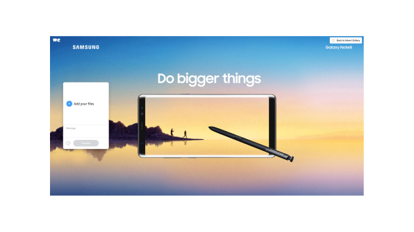
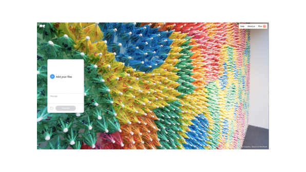
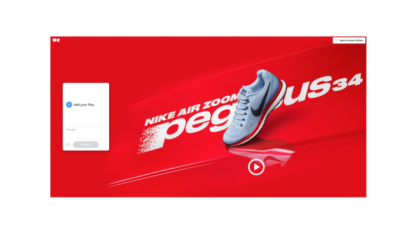
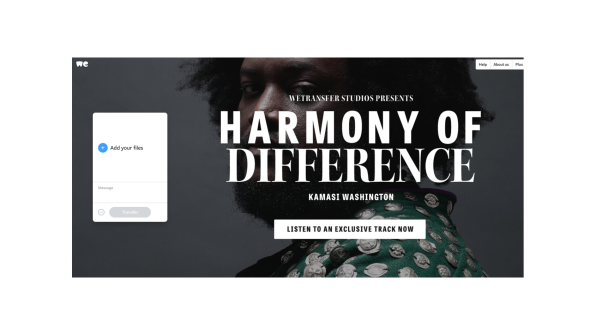
When users send a file through the site, there’s no sign up necessary to use the free service. (But there is a premium version that charges a fee.) Every step in the file-transfer process happens in a compact box on the home page. The attractive background is a full-bleed image of either an ad (produced in house), an editorial (curated and authored by WeTransfer), or wallpaper. All share similar aesthetics. They’re eye-catching enough to get your attention, but so consistent in their sensibility, that you could gloss over them entirely if you wanted and go about business as usual, undistracted.
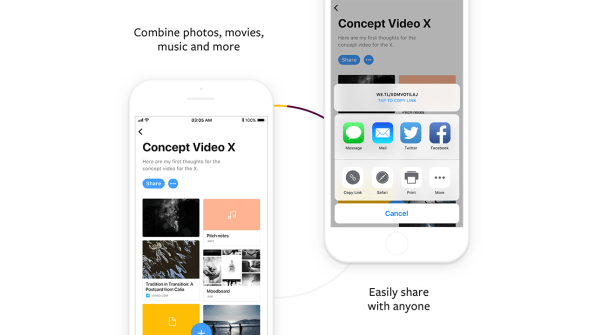
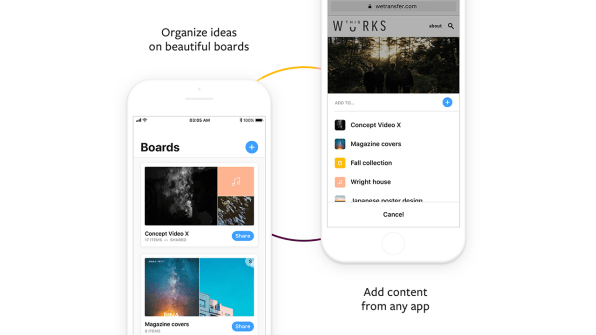
Earlier this week, WeTransfer launched a new, free mobile app that builds on this approach. Before, the company’s app was essentially a mobile version of the desktop site–a file-sharing tool. Now it’s Pinterest-like. Users can create mood boards and collect the links they read, photos they take, and music they hear all in one place.Dutch creatives Bas Berens and Ronald Hans (who goes by the name Nalden) founded WeTransfer in 2009 with the idea of creating the file-sharing service they wanted, but didn’t exist. Today, it has 40 million active users; 75% of whom identify as creatives. Every month WeTransfer sends 1 billion files and its ads achieve a click-through rate that’s two-and-a-half times higher than the industry average–a rate the company believes it receives because its treats advertising like art. (You could argue this is a dark pattern because the ads look so similar to WeTransfer’s editorial and other wallpapers.)
Unlike most tech companies that take on venture funding early on, WeTransfer bootstrapped itself to profitability, which it reached in 2014. Without investor-added pressure to meet certain growth goals, the company had the freedom to focus on UX and crafting the brand it wanted. Proving that its approach found the audience it wanted, WeTransfer was able to get a $25 million dollar investment from Highland Capital in 2015. Now it’s in expansion mode. In December 2016, the company hired a new CEO, Gordon Willoughby, who was previously at Amazon.
“We don’t necessarily get that excited about the concept of mass storage and synchronization,” Bradfield says. “The future, and the things that will motivate us moving forward, is producing experiences that’s aren’t going upstream into cloud storage, but downstream and simplifying the web, decluttering, and creating more trust between us and the other experiences we have.”
From its outset, WeTransfer has been building goodwill with creatives and constructed its entire experience–from product to branding to marketing–with this audience in mind. It donated 30% of its wallpapers to artists–visual, performing, musical–and picked people to feature based on who its employees liked and were passionate about. (“The goal was to send so much traffic to their site, it would bring their site down,” Bradfield says of the artists they spotlighted.)
The company has steadily, and quietly, been expanding its properties under the leadership of its head of experiences, Nelly Ben Hayoun . There’s a chance you haven’t heard about most of them. (I use WeTransfer’s free service regularly–along with a host of other file sharing services–and didn’t know about most extras until researching this story, a testament to their unobtrusiveness.)
In 2016, the company formally branded the production arm of the company that creates content for artists as WeTransfer Studios. That same year it formally grouped its editorial as This Works, a blog and online magazine. Last year, it launched a browser extension so that users could be greeted with a WeTransfer-curated image upon opening Chrome.The idea is that by producing good creative work, people who make good creative work themselves will recognize it and continue to turn to WeTransfer for whatever new vertical its creates.
“It’s a [Main] Street-store mentality,” Bradfield says. “The front door is always open. You can come in use our service and leave, and come back. We have the confidence that they will [return].”
The company also has a number of efforts outside of digital products that caters to its audience. It co-sponsors a free architecture school, donates free premium accounts to art students, and offered former SoundCloud employees $10,000 to fuel their creative pursuits instead of immediately jumping into a 9-5 post-layoff.
Since its launch, WeTransfer hasn’t been building a better file sharing service. That part of the company has remained relatively unchanged. But it’s been building an audience of creatives and keeping them in mind as they expand.In 2015, WeTransfer had about 30 employees; now it’s up to 100. Bradfield says the company is experiencing double-digit revenue growth year on year. Speed of growth–in terms of user numbers–hasn’t been the goal; rather, retaining the audience along the way has. The company plans to keep this approach as it moves forward, always keeping in mind that its experience be centered around simplicity and making it easier for creatives to be creative.
While other file-sharing services, like Dropbox, are rebranding and trying to emulate WeTransfer’s punchy look, at their core they’re still cloud services and are competing with one another. But WeTransfer isn’t just competing against Dropbox and Hightail. It’s competing with Nowness, Dazed, and Dezeen for editorial; Vice for sponsored video production; and even Google (since the company also has an email service). When I ask Bradfield about one of the biggest challenges for growth, he says it’s maintaining credibility.
“We’re broad enough in our user base to move into different avenues, but we couldn’t do that if we didn’t have the creative community,” Bradfield says. “As long as we’re cautious and credible, we have many opportunities. It’s similar to Apple in that Apple isn’t a technology company–it’s a hardware company, a music company, it’s a retailer, it’s a space that the creative audience trusts.”
[“Source-fastcodesign”]


