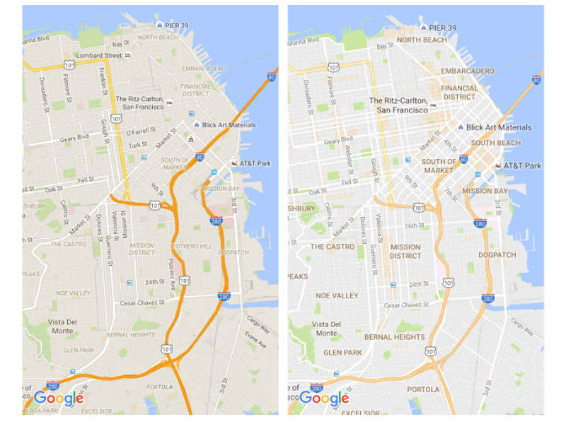
Search giant Google has updated its Maps to bring in a new user-friendly design. The changes includes a cleaner and simpler look with balanced colour schemes, and a new feature called ‘areas of interest’ that highlights “places where there’s a lot of activities and things to do”.
These areas of interest are busier areas of the map that will be shaded in orange for users to zoom and peek, and make a pit stop if they will. The update is rolling out gradually to iOS, Android, and desktop users of Google Maps across the globe.
“As part of this update, we’ve removed elements that aren’t absolutely required (like road outlines). The result is a cleaner look that makes it easier to see helpful and actionable information like traffic and transit. And we’ve improved the typography of street names, points of interest, transit stations, and more to make them more distinguishable from other things on the map, helping you navigate the world with fewer distractions,” Google explains on its blog.
(Also see: Google Maps for Android Getting Wi-Fi Only Mode and More)
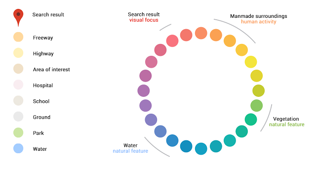
There also a new colour scheme that has been introduced with this update. Different colours represent different things around you, like the park is shown in Green, while water bodies are shown in Blue. Similarly, there are colours assigned to freeways, highways, hospitals, schools, and even open grounds.
 (Also see: Google Makes It Easier to Add Places and Suggest Changes in Maps)
The Google Maps app for Android recently also got the ability to add multiple destinations to your route. This is useful when you have to manoeuvre around areas making multiple stops. Users need to feed in pit stops, and Google Maps will route a way to all the destinations in your desired order, and begin navigation.
[“Source-Gadgets”]


