Think about the last time you visited the FAQ section on a website.
Why must the map on how to navigate the site be sequestered away from the site itself?
Users are often forced to leave whichever page they are looking at in order to track down information somewhere else on your website. And this puts all the burden on your customers, rather than on your website where it should be. Not only must customers leave the page they are looking at to find the information they want. They are often met with pages of gray print that take time to sift through.
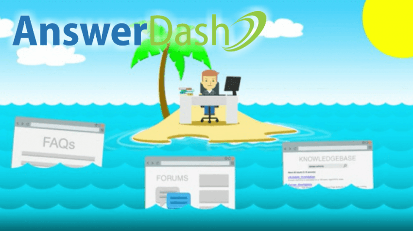
AnswerDash has provided an answer to this predicament. The company has eliminated the use of ‘help islands’; or separate, standalone pages that are often slapped onto sites with little to no integration into the flow of the information . Rather than being redirected to a separate page, users are able to access a tab on the page itself and search from there.
This is the exact opposite of the standard help island formula. As AnswerDash representative Morgan Moretz said in an email interview with Small Business Trends, “AnswerDash is the next generation of website self-service that gives users the right answers, at the right place, at the right time.
“With AnswerDash, digging through knowledge base articles is avoided. Lengthy typing sessions back-and-forth in a live chat window, whether with a bot or a human, are avoided. Phone calls are avoided. Although this type of ‘in-context’ help has been a concept known to computer scientists for decades, AnswerDash is the first company ever to provide it as a SaaS-based answer layer that can grow over time as Web visitors ask new questions.”
AnswerDash also makes use of analytics, providing the site with data about which questions are asked most often. This data, in turn, provides insights into what is causing potential customers to unsubscribe, abandon carts, or just leave, so that the issues can be addressed and fixed. “Our data shows that 5 to 15 percent of customers on a website will use AnswerDash to get answers to their questions,” Moretz mentions, “That’s 50 to 150 times as much usage as most online businesses that rely on help islands to provide answers.”
According to AnswerDash’s own case study (PDF), its tool helps to reduce customer support volumes by up to 50 percent, which means customers are spending more time looking at your product, not an FAQ. Not only do they spend less time searching for answers, but they also spend less time contacting support phone lines, live chat options, or email. (These solutions can be costly or inconvenient for both parties anyway.) By simply accessing a small tab at the top of the page, users are able to access a list of questions and issues giving them information as quickly as possible.
Creating a streamlined system is critical to retaining customers on your site. When users encounter problems, they often become frustrated, and negative experiences do not bring about repeat customers. Instead, AnswerDash tried to design its system to minimize reliance on huge Q&A sections or frustrating customer support.
Moretz says, “In recognition of most people’s desire to solve their own problems rather than contacting customer support, AnswerDash makes getting self-service answers easy — much easier than FAQs or other help islands. In fact, most customers never need to type a single word when getting answers with AnswerDash since it’s based on the power of point-and-click.
Image: AnswerDash
[“source-smallbiztrends”]


